Overview
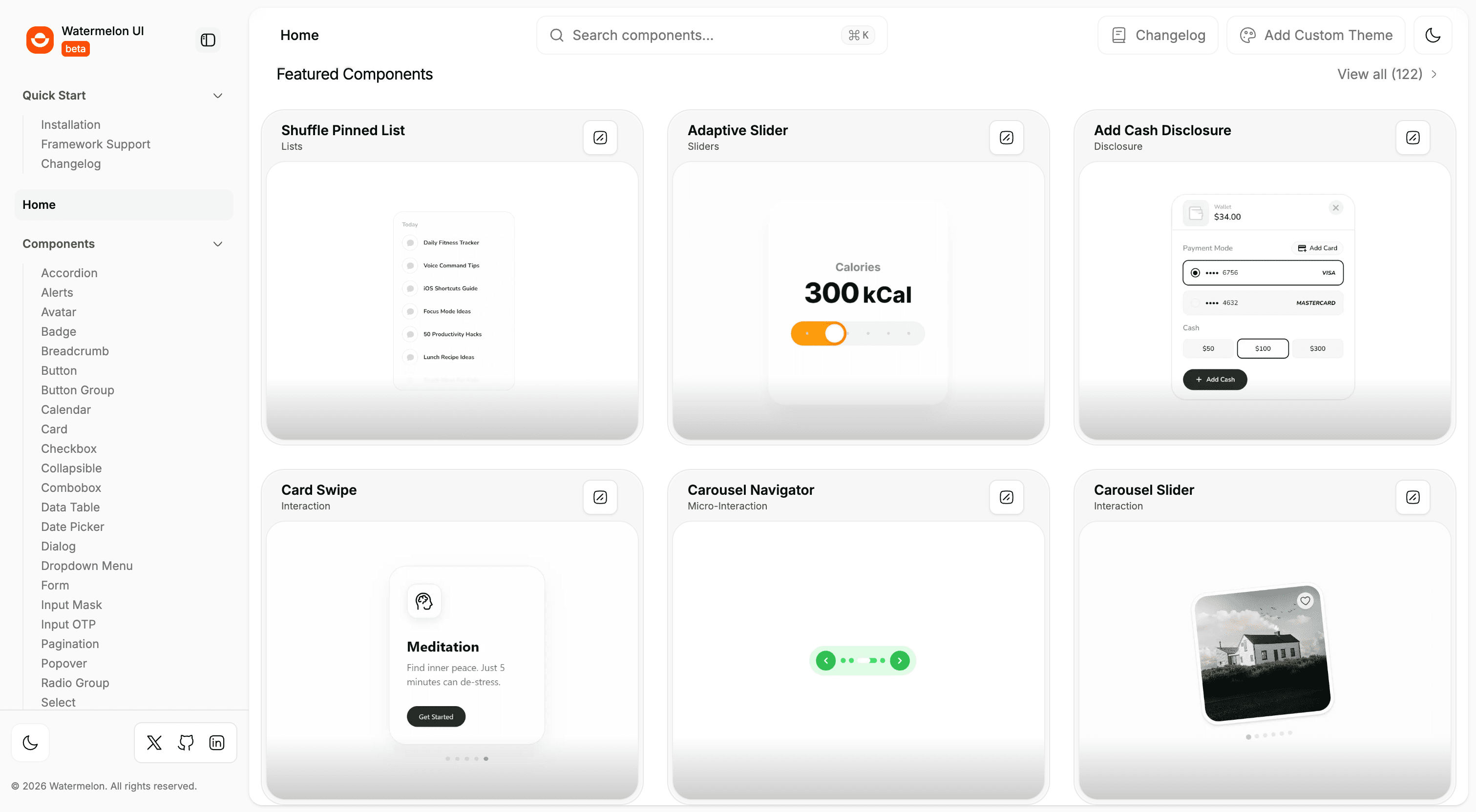
Watermelon UI is a component platform with discovery, high-fidelity previews, install docs, a changelog, and a registry that scales as new patterns land. You can find a pattern, preview it, and install it from one place.
Problem
UI references lived in Figma files, Slack threads, and half-documented Storybook entries. Teams rediscovered the same patterns: there was no search-first catalogue, no copy-paste install, and no release history they could trust.
Goals
- Find a component without already knowing its name
- Show preview and code together, with install blocks built for paste
- Keep metadata consistent so new entries do not need one-off page templates
- Publish a changelog so shared UI is safe to adopt
What I shipped
- Categorized side nav, search, and a featured surface for high-value patterns
- Full-page and inline preview modes, MDX docs, copy-paste install blocks
- Registry metadata so dashboards, blocks, and new components grow on the same template
- Release notes and version history
Screens
Screens
Walkthrough
Outcome
Teams find, preview, install, and customize from one catalogue instead of hunting informal references.
Context
I owned architecture and shipping from discovery through launch, working with design and product on hierarchy and interaction. This started as internship work.
Stack
Next.js, TypeScript, Tailwind CSS, shadcn/ui, Motion, MDX.